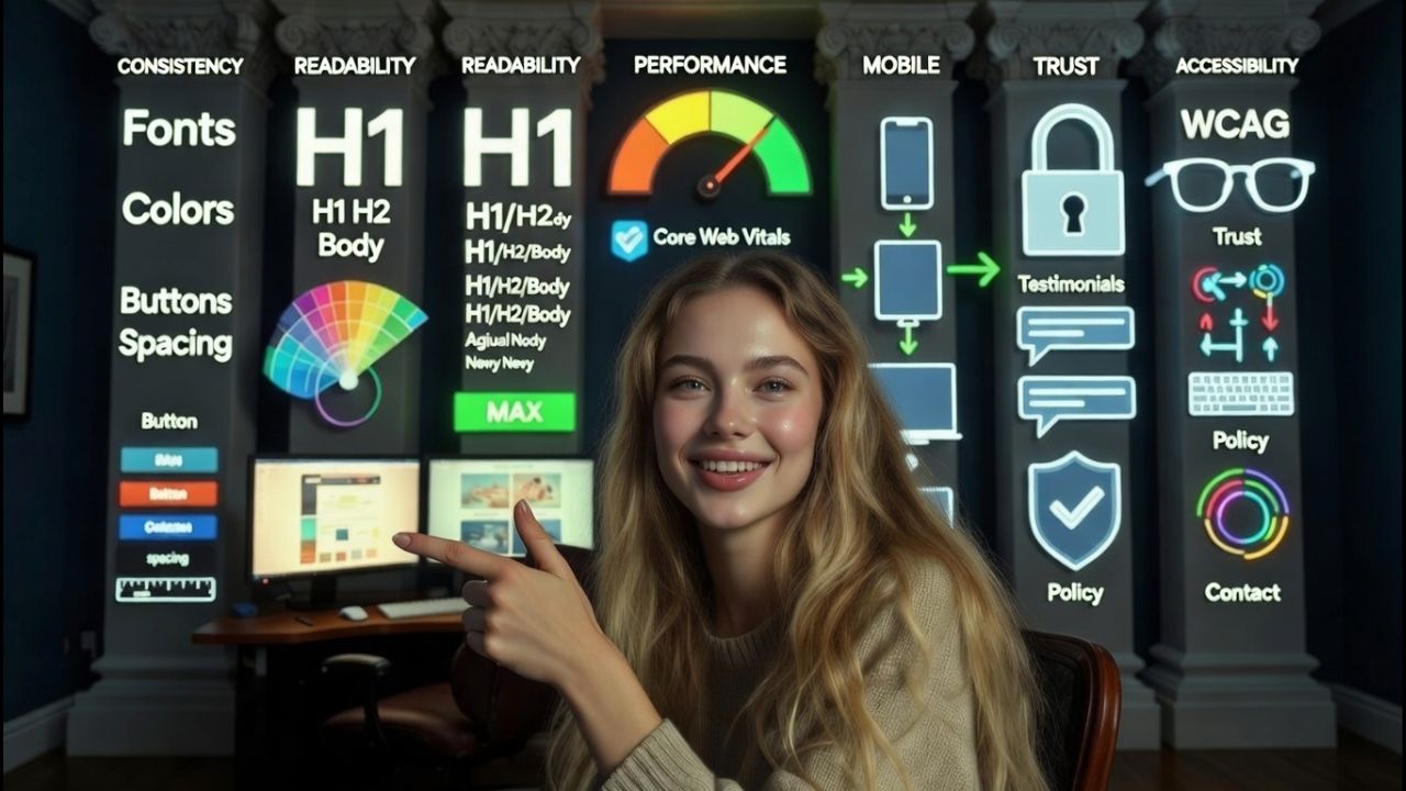
To make a website look professional, use a clean grid based layout, consistent branding, readable typography, mobile responsive design, fast performance, accessible color contrast, and clear navigation.
Add high quality visuals, concise copy, trust signals (HTTPS, policies, testimonials), and well styled forms. Polish details like spacing, hover states, and footer structure to elevate credibility and conversions.
If you’re wondering how to make a website look professional, the answer is a mix of clean design, consistent branding, and technical polish. Professional websites feel trustworthy because they’re easy to read, fast on mobile, and visually consistent. This guide breaks down practical steps anyone can implement today.
What Makes a Website Look Professional?
Professional website design is less about flashy effects and more about clarity and consistency.

Users judge credibility in seconds, often from typography, spacing, and how quickly the page loads. Nail these pillars and your site instantly feels established.
Core pillars of a professional look
- Consistency: Unified fonts, colors, button styles, and spacing scale site wide.
- Readability: Clear hierarchy with headings, short paragraphs, and adequate contrast.
- Performance: Fast load times and smooth interactions (Core Web Vitals).
- Mobile first responsiveness: Layouts adapt gracefully at common breakpoints.
- Trust: HTTPS, real contact info, policies, testimonials, and brand legitimacy.
- Accessibility: WCAG aligned color contrast, focus states, alt text, and keyboard navigation.
How to Make a Website Look Professional: Step-by-Step Guide
1) Start with a simple, grid based layout
Use a 12 column grid and set generous margins. Avoid cluttered sidebars and carousels. One clear hero section with a direct headline, subhead, and primary call to action (CTA) beats a busy collage every time.
2) Choose a professional typography system
- Pair one sans serif for UI (e.g., Inter, Roboto) with a serif or clean sans for headings.
- Set a clear scale: H1 32–40px, H2 24–28px, body 16–18px, line height ~1.5–1.7.
- Limit to 2 font families, 3–4 weights max to avoid a messy look.
3) Build a restrained color palette with accessible contrast
- 1 primary brand color, 1–2 neutrals (light/dark), 1 accent.
- Meet WCAG AA: body text contrast ratio ≥ 4.5:1; large text ≥ 3:1.
- Reserve your brand color for CTAs and links to make actions obvious.
4) Master spacing and alignment
Whitespace signals confidence. Use an 8px spacing scale consistently. Align content to the same grid. Uneven padding, misaligned cards, and cramped sections are instant “amateur” giveaways.
5) Use high quality, on brand visuals
- Prefer original images or curated stock with consistent lighting and style.
- Optimize images (WebP/AVIF) and crop consistently for uniform cards and heroes.
- Keep icon style consistent (outline vs filled) and avoid pixelation.
6) Simplify navigation and information architecture
- Keep top nav to 5–7 primary links; push extras to the footer.
- Use descriptive labels (e.g., “Pricing,” “Services,” “Contact”), not clever jargon.
- Make the logo clickable to Home; highlight the current page with a clear state.
7) Design mobile first and test real breakpoints
- Plan for 360px, 768px, 1024px+, and common high density screens.
- Make tap targets ≥ 44px. Avoid hover only interactions on touch devices.
- Prioritize above the fold clarity and fast content paint.
8) Optimize performance and Core Web Vitals
- Compress images, defer non critical scripts, and lazy load below the fold media.
- Use a CDN and proper caching. Keep total JS/CSS minimal, avoid plugin bloat.
- Target: LCP < 2.5s, CLS < 0.1, INP < 200ms for a polished feel.
9) Write clear, scannable copy
- Lead with outcomes and benefits; back with brief proof (stats, logos, testimonials).
- Use short paragraphs, bullet lists, and action oriented CTAs.
- Maintain tone and terminology consistency site wide to reinforce branding.
10) Add trust and compliance signals
- HTTPS, clear contact info, company address, and professional email domain.
- Privacy Policy, Terms, and Cookie Notice accessible in the footer.
- Social proof: testimonials, case studies, third party reviews, and press mentions.
11) Polish forms, states, and micro interactions
- Use clear labels, helpful error messages, and logical tab order.
- Style focus states for accessibility. Provide loading spinners and success toasts.
- Limit fields; ask only what you need. Use concise microcopy under inputs.
If your website handles high traffic, choosing powerful hosting is important for speed & stability. You can explore the best dedicated server providers in India for reliable performance and pricing.
Quick Apply Professional Design Checklist
- One clean hero with a single CTA.
- Two font system, body at 16–18px, generous line height.
- Consistent button styles (primary, secondary) across all pages.
- Unified spacing scale (8px), same gutter widths per breakpoint.
- All images optimized, consistent aspect ratios, and lazy loaded.
- Navigation trimmed to essentials; search if content heavy.
- Readable color contrast; accessible focus states; descriptive link text.
- Fast performance: audit plugins, compress assets, defer JS.
- Professional footer with sitemap links, contact, legal, and social.
Branding Consistency That Sells Credibility
Logo, favicon, and brand marks
Use a high res SVG or PNG logo with padding. Set a favicon and app icons so your brand looks legitimate in browser tabs and mobile home screens. Keep minimum clear space and stick to approved color variations.
CTA and component system
Document primary and secondary buttons, cards, badges, forms, and modals. Reuse components instead of inventing new ones on each page. Consistency reduces cognitive load and looks enterprise grade.
Imagery and voice
Choose a photography style (people focused, product first, or abstract) and keep it consistent. Match your copy tone to your audience, plain spoken and benefit led beats buzzwords.
Also Read: How to Add Voice Search in Website
Technical Polish Users Feel (Even If They Can’t Name It)
Structure and SEO basics
- Semantic HTML: one H1 per page, logical H2/H3 hierarchy, descriptive titles and metas.
- Schema markup for Organization, Product, FAQ, and Breadcrumbs where relevant.
- Clear, human readable URLs and an XML sitemap; block thin/duplicate pages.
Error, empty, and loading states
Style your 404 page with helpful links, show skeleton screens or spinners on fetches, and write friendly empty state messages. These small touches scream “professional.”
Font loading and asset strategy
- Use font display: swap for fast text rendering; preload critical fonts.
- Bundle and minify CSS/JS, but only load what a page needs. Avoid render blocking.
- Serve images via CDN; use responsive srcset/sizes attributes.
/* Starter CSS tokens for professional, consistent rhythm */
:root{
  --font-base: 16px;
  --scale: 1.25; /* typographic scale */
  --space-1: 8px; --space-2: 16px; --space-3: 24px; --space-4: 32px; --space-5: 48px;
  --brand: #2B6CB0; --accent: #ED8936; --text: #1A202C; --muted: #4A5568; --bg: #FFFFFF;
  --radius: 8px; --shadow-1: 0 6px 16px rgba(0,0,0,.08);
}

body{font-size:var(--font-base); line-height:1.6; color:var(--text); background:var(--bg);}
h1{font-size:calc(var(--font-base) * 2.25);} h2{font-size:calc(var(--font-base) * 1.75);} h3{font-size:calc(var(--font-base) * 1.5);}
.container{max-width:1200px; margin:auto; padding:0 var(--space-3);}
.btn{background:var(--brand); color:#fff; padding:12px 20px; border-radius:var(--radius); box-shadow:var(--shadow-1);}
.btn:hover{filter:brightness(1.05);}
.card{border:1px solid #E2E8F0; border-radius:var(--radius); padding:var(--space-3); box-shadow:var(--shadow-1);}
a{color:var(--brand);} a:hover{text-decoration:underline;}
/* Meet contrast guidelines and keep consistent spacing across components */
Common Mistakes That Make Sites Look Amateur
- Too many fonts, colors, and button styles.
- Low contrast text and cramped line height that hurts readability.
- Pixelated images, inconsistent icon styles, and mismatched aspect ratios.
- Slow pages from oversized images and unnecessary plugins.
- Confusing nav labels, cluttered mega menus, and weak CTAs.
- Missing legal pages, no HTTPS, or vague contact info.
- Unstyled 404 pages, broken links, and sloppy hover/focus states.
Before/After Quick Wins in One Afternoon
- Replace hero slider with one focused headline, subhead, and CTA.
- Switch to a two font system and set a consistent heading scale.
- Standardize button styles and link colors; update hover/focus states.
- Compress and convert top images to WebP; implement lazy loading.
- Trim navigation to core pages; add a clean footer with legal and contact.
- Rewrite top sections into short, benefit led paragraphs and bullets.
Theme vs. Page Builder vs. Custom: What Looks Most Professional?
- Well built theme: Fastest path to professional look if you keep defaults consistent and avoid stacking plugins.
- Page builder: Flexible, but easy to over style; enforce a design system, global styles, and a component library.
- Custom build: Maximum polish and performance if you have dev/design resources; best for long term scalability.
Also Read: How to Enlarge Image Without Losing Quality
FAQs
What are the fastest ways to make my website look professional today?
Unify fonts and button styles, increase line height and spacing, compress images, simplify the navigation, and add a clear hero section with one CTA. Ensure HTTPS, add Privacy/Terms to the footer, and fix obvious layout misalignments.
Which fonts make a website look professional?
Pair a modern sans serif like Inter, Roboto, or Source Sans for UI with a complementary heading font (e.g., Poppins, IBM Plex Sans, or a restrained serif like Merriweather). Keep families to two, sizes readable (16–18px body), and limit weights to three or four.
How do I choose colors for a professional website?
Select one primary brand color, 1–2 neutral grays, and a single accent. Test contrast to meet WCAG AA for text. Use brand color for CTAs and links, neutrals for backgrounds and text, and apply accent sparingly for highlights.
What makes a homepage look trustworthy?
Clear value proposition, one primary CTA, social proof (testimonials, logos), clean navigation, fast load times, and visible trust elements (HTTPS, contact info, policies). Professional imagery and consistent spacing seal the impression.
Do I need a designer to achieve a professional look?
No. With a quality theme, a defined style guide (fonts, colors, spacing), and best practices like accessible contrast, image optimization, and consistent components, you can get 80% there. For brand identity and complex UX, a designer accelerates refinement.
Professional polish is the sum of small, consistent decisions. Start with typography, spacing, and imagery; then iterate on performance, accessibility, and trust signals. Keep it simple, consistent, and fast and your website will look and feel professional.


